Cherries have been captivating artists for centuries.
They’ve shown up in still life paintings, botanical illustrations, food photography, and even popular culture.
Partly because they are simple in shape, partly because capturing their gloss and depth is a neat challenge. And partly because, honestly, who can resist drawing something that looks cute and tasty?
As a hobby artist, I’ve drawn cherries more times than I can count.
Each time, I found something new. Like how light bounces off their skin, how the stem curves, how subtle shadowing makes them look round instead of flat.
That mix of simplicity and complexity makes cherries a perfect practice subject: not too overwhelming, but enough nuance to teach you shading, value, contrast, and observation.
Besides, it’s a perfect way to put into practice the lessons you learned about drawing and shading a sphere. If you haven’t, I’d recommend you check out that tutorial.
Nonetheless, in this guide, I’ll walk you through seven easy steps to draw realistic cherries. We’ll start from basic shapes and end with highlights and small details.
I wrote this like I’m sitting next to you with a pencil and paper, trying things out, making mistakes, tweaking. So don’t worry if your first try isn’t perfect.
Before we begin, a few Considerations
Always use references: Real cherries or high-quality photos will help you see how the light interacts with the surface. You can check out Pexels or Pixabay for royalty-free images.
Use different pencils or even mix with charcoal: A softer pencil (like 5B or 8B) or charcoal is perfect for deep shadows, while a harder one (like H) keeps highlights clean.
Practice with pairs or triples: Cherries often come in twos, so sketching them together can help you practice overlapping forms and connected stems.
7 Step Tutorial on How to Draw Realistic Cherries
Drawing a circle and a curve for the stem
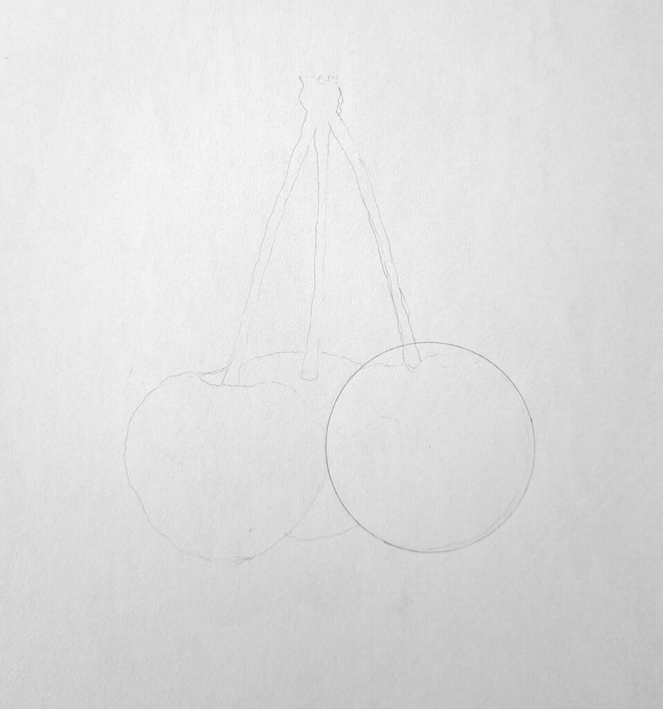
Begin by sketching a light circle. You can use a round object like a coin or a geometric compass to draw the circle. In my illustration, I’ve used the latter.
You can also draw your circle freehand, making sure you don’t press too hard. It’s okay if the circle isn’t perfect. But try your best.
Then add a gentle curved line from the top of where the stem will attach, as shown in my second illustration.
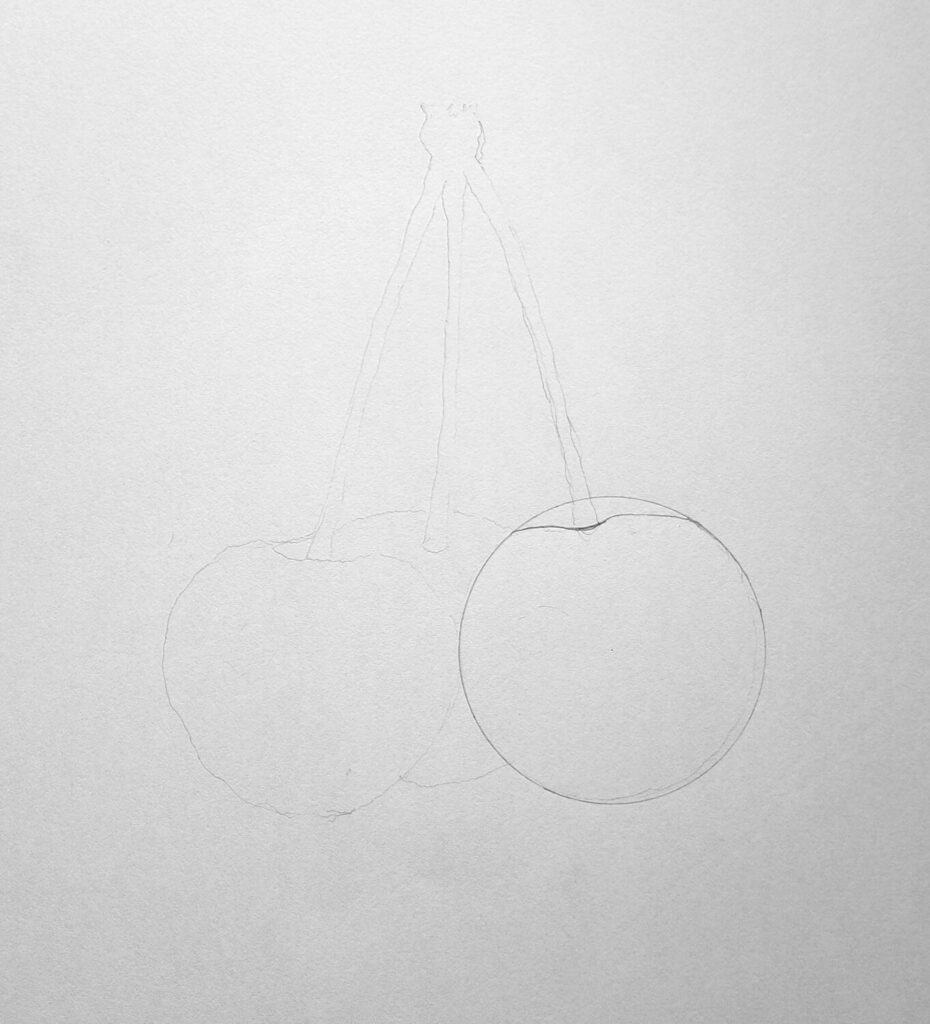
Complete outlining the cherry sketch.
Since the cherry is rarely a perfect circle, erase part of the circle that you no longer require.
This leaves a small arc at the top of the circle where the stem will connect. This mimics how, in real cherries, the top dips slightly.
Now refine the outline: Feel free to adjust the general shape of the cherry to your liking by smoothing out bumps, and adjust the shape so it looks organic.
If you have several cherries attached, sketch them using the same methodology, add their stems, and make sure they overlap or touch naturally.
In my sketch, notice how the three cherries appear next to each other. At this point, you should have the basic cherry drawing that you can paint, color, or continue shading using graphite pencils, like we’re about to do.
Shade the shadowed areas.
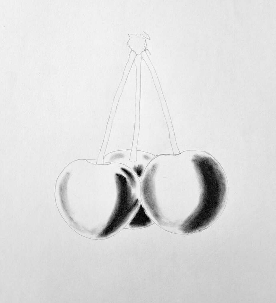
The first step in shading is to decide where your light source is coming from.
The side opposite has the deepest shadows.
Using a softer, darker pencil (like 4B, 6B, or 8B), press a bit more to lay down dark tones. Build these shadows gradually so they feel rich. Depending on how you want your shadows, you can use a soft Pitt charcoal as a base before shading with your graphite.
Always remember to blend everything using a tissue paper, or a Q-tip, my all-time favorite.
Shading the light values
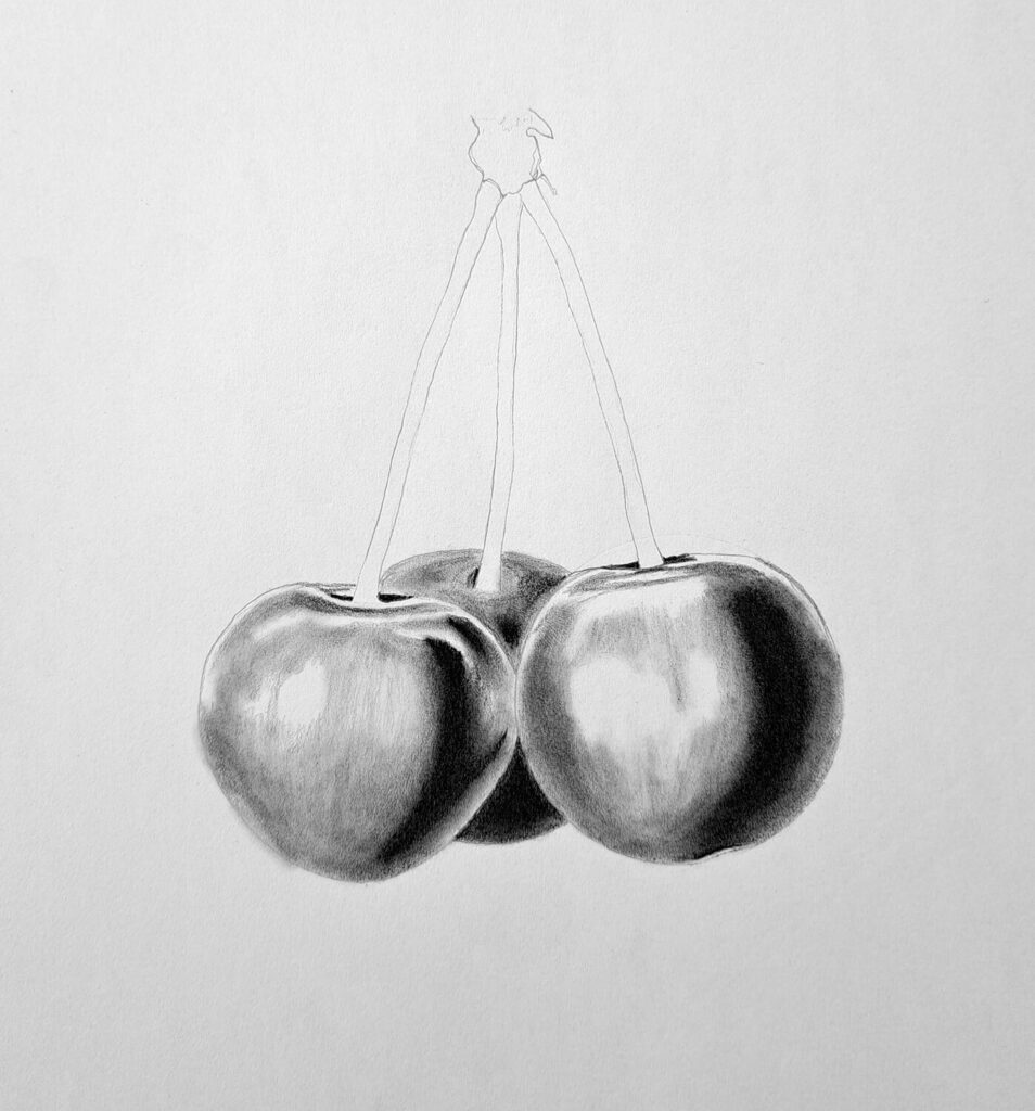
On the side facing the light source, use an HB pencil to shade light values. These areas aren’t fully white, and they aren’t necessarily dark.
While you shade, decide where your highlights are and exclude them altogether. Blend the shaded area lightly and separately from the dark area.
The goal is to have two distinct areas, as shown in my drawing illustration.
Shading the midtones and transitions
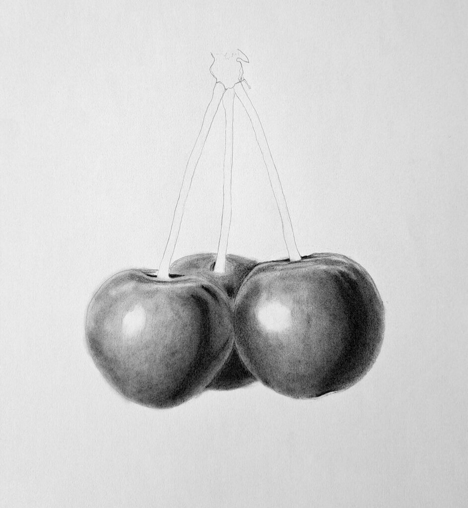
The next step is to fill in the space between dark shadows and lighter areas with midtone values. Use a range of pencils, like B to 4B.
This area is the bridge that will make your cherry look round.
Work slowly.
Sometimes go back and forth: lighten, darken. Make sure there isn’t a harsh line or distinct boundary. Instead, we want a smooth transition since real cherries have very soft gradations of tone in many places.
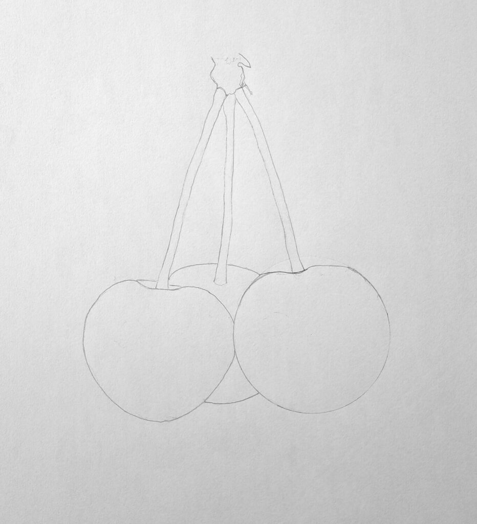
Shading the stems of the cherries
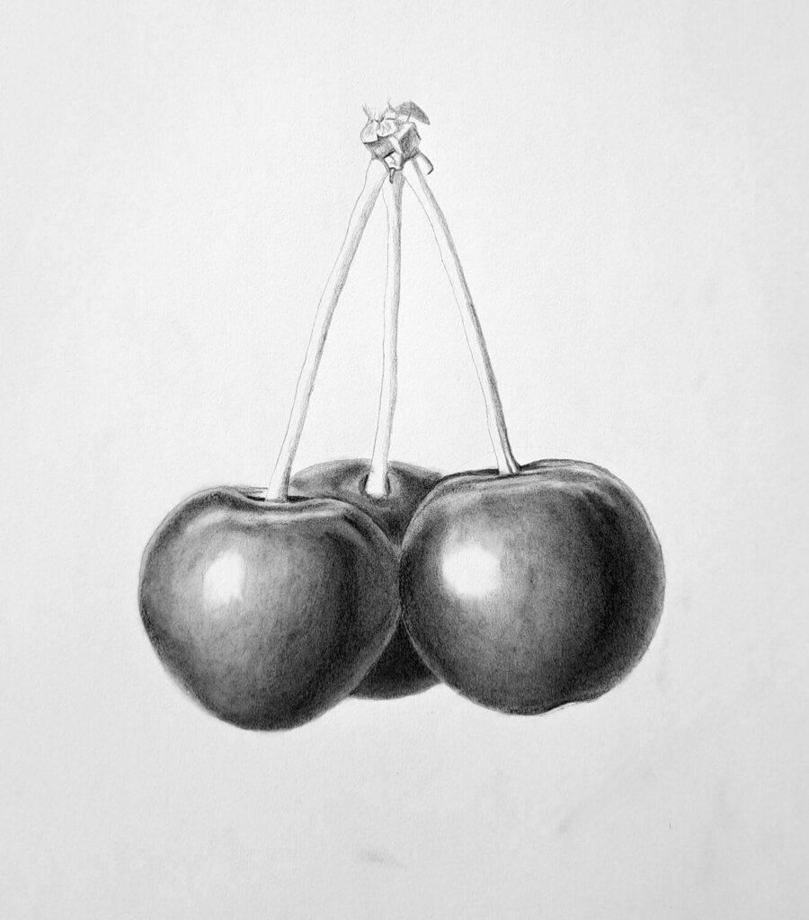
Now switch to shading the stems. They’re thinner, smaller, but still have form. Use lighter pressure or an H pencil, but include some shadow along one side or where it bends.
Also, pay attention to where it attaches to the cherry. That joint often has a little shadow, maybe even a tiny fold or dip. Small details like that make things look realistic.
Moreover, ff you’re drawing several cherries with a shared stem, make sure the connection looks natural, almost like a tiny notch as shown in the drawing illustration above.
If you want to get better at shading cylindrical objects like stems, you’d better check out this tutorial about drawing and shading cylinders.
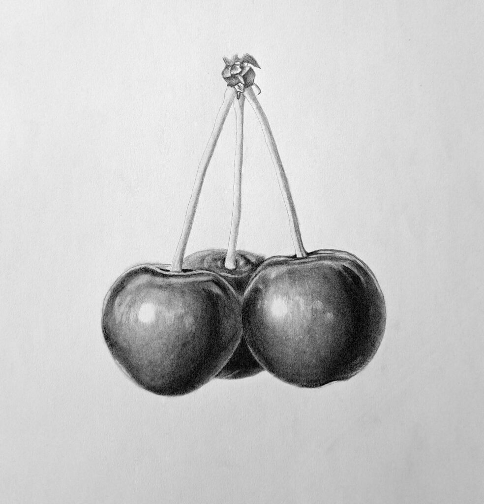
Finalizing the drawing with highlights and details

Finally! You’ve done it.
Now take a step back. Clean up sketch lines or smudges. Use a kneadable eraser to lift out highlights, those bright little spots where light reflects most strongly on the cherries.
Add texture if you want: tiny skin imperfections, slight indentations, maybe reflections of nearby objects.
Maybe even a soft shadow below the cherries so they don’t look like they’re floating. But that’s only necessary if they’re placed on an object like a table. Otherwise, if they seem to float, indicating hanging from a branch, it’s also acceptable.
Here are additional guides for drawing fruits:
Conclusion
Drawing realistic cherries is one of those exercises that teaches you a lot about observing light, understanding value, and practicing patience.
You might start with a rough circle and some shading that looks messy, but bit by bit, you build up smoother transitions, realistic curves, and those bright, juicy highlights.
What matters most is practice and observation.
Look at real cherries under different lighting. Notice where the shadows deepen. Look for where the highlights glint. Try drawing cherries from life or good photos.
Every time you do this, you’ll see improvement.
And you’ll also start noticing little tricks, maybe a highlight you didn’t think about, or a stem shape that feels more natural