
Having a drawer full of pencils won’t necessarily make you shade better. The real skill comes from controlling the marks those pencils make.
That’s where shading techniques come in handy.
And with enough practice, you can produce almost any value and texture imaginable.
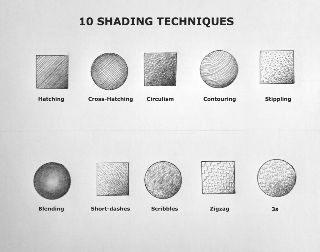
There are dozens of ways to shade with graphite, and artists often combine several in the same drawing. For instance, there are four main techniques, including parallel hatching, cross-hatching, contour hatching, and stippling as distinct approaches to creating form.
However, with some modification, you can develop even more approaches.
The ten techniques below give you a useful foundation. Some are traditional, some are wonderfully loose, and a few are particularly useful when you’re trying to create texture.
I’ve arranged them as practical techniques you can see and practice, not as a list of terminology to memorize.
Let’s check them out:
10 Useful Shading Techniques for Realistic Shading
1. Hatching Shading Technique
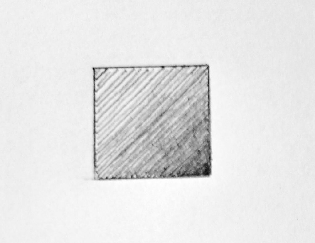
Hatching is probably the first pencil shading technique most artists encounter, and for good reason. It’s simple: you create tone by drawing a series of parallel lines.
The lines can be long or short, straight or slightly curved, widely spaced or packed closely together.
The basic principle is that more space between the marks leaves more paper visible and creates a lighter value. Bringing the lines closer together increases the visual density and produces a darker value.
You can check out Paul Flandrin’s Portrait of a Woman to see this technique in practice.
If you’re practicing hatching, try filling a small rectangle with parallel lines. Begin with generous spacing, then gradually reduce the gaps until you reach a much darker tone. Keep your pressure reasonably consistent and let the spacing do much of the work.
Once you have that under control, experiment with pressure. A lighter touch creates delicate marks, while additional pressure produces stronger, darker lines.
When to use hatching
Hatching works particularly well for:
- Broad areas of shadow
- Sketches with a visible linear quality
- Architectural and structural subjects
- Clothing and fabric
- Hair and certain types of fur
- Drawings where you want the individual pencil marks to remain visible
One common mistake is making every line identical. Perfectly uniform lines can make a drawing look mechanical. Small variations in length, pressure, and spacing can give the shading considerably more life.
2. Cross-Hatching
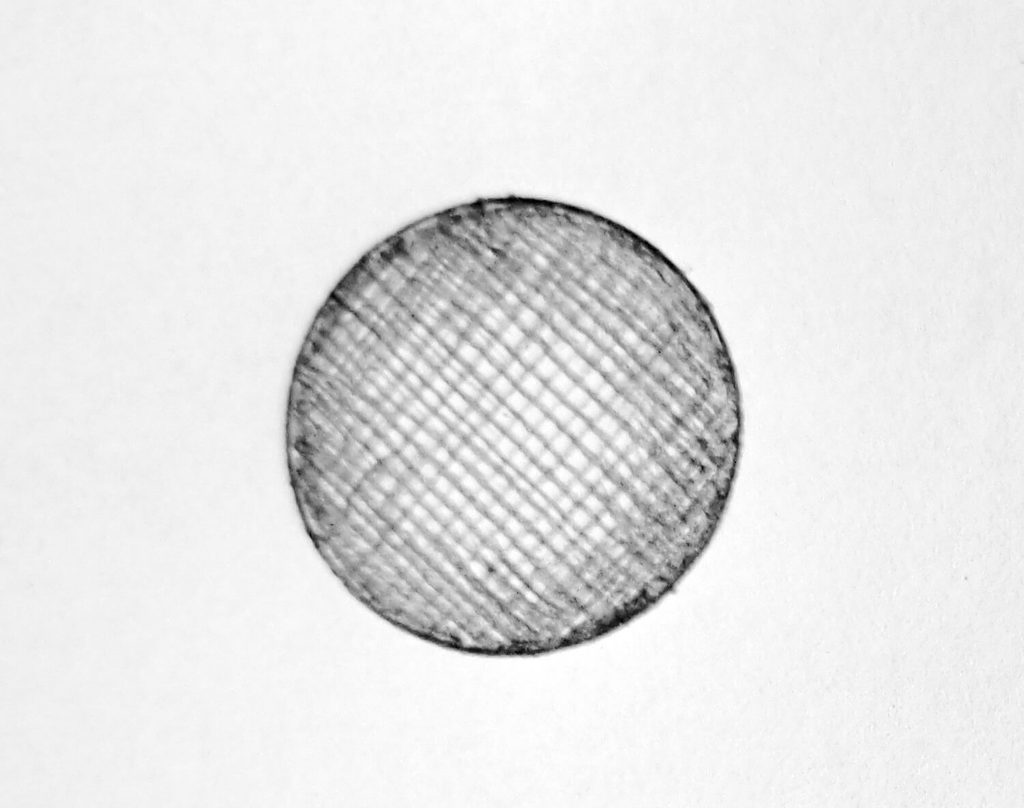
Cross-hatching takes the basic idea of hatching and adds another layer.
First, you lay down a group of parallel lines. Then you place another group of lines across them at an angle. Add further layers if you need to build a deeper value.
The result is a network of intersecting marks that can produce surprisingly rich tones.
You don’t necessarily have to cross the lines at exactly 90 degrees. In fact, varying the angle can make the technique more expressive.
Try one layer running diagonally from upper left to lower right. Add another running from upper right to lower left. Then experiment with a third layer running more vertically.
As you add layers, the paper gradually disappears beneath the graphite. That gives you another way to control value without simply pressing harder with the pencil.
Cross-hatching is also useful when you want the viewer to see how the drawing was made. Rather than hiding the marks, you’re allowing them to become part of the visual language of the artwork.
A useful exercise
Draw five small squares.
Leave the first almost white. Shade the second with one layer of widely spaced hatching. Add a second layer to the third, a third layer to the fourth, and make the fifth your darkest.
This simple exercise teaches an important lesson: value can come from accumulation of strokes, not just pressure.
3. Circulism Shading
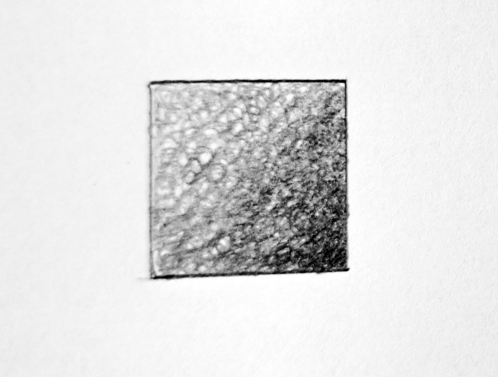
Instead of moving the pencil back and forth in straight lines as described above, you move it in small loops. The circles can overlap heavily, creating a relatively even layer of graphite, or remain more open to produce a lighter tone.
Circulism is particularly useful when you want to avoid an obviously linear appearance. Because the marks move in several directions, they can produce a softer-looking surface.
It’s often useful for subjects with rounded or irregular textures, including skin, some types of stone, cloudy surfaces, and certain organic forms.
The technique also gives you an interesting way to build a value gradually. Start with very light circles, then make additional passes over the areas that need to become darker.
Try not to make every circle the same size. Natural-looking surfaces rarely consist of perfectly repeated marks. Small variations make the texture less predictable.
4. Contouring
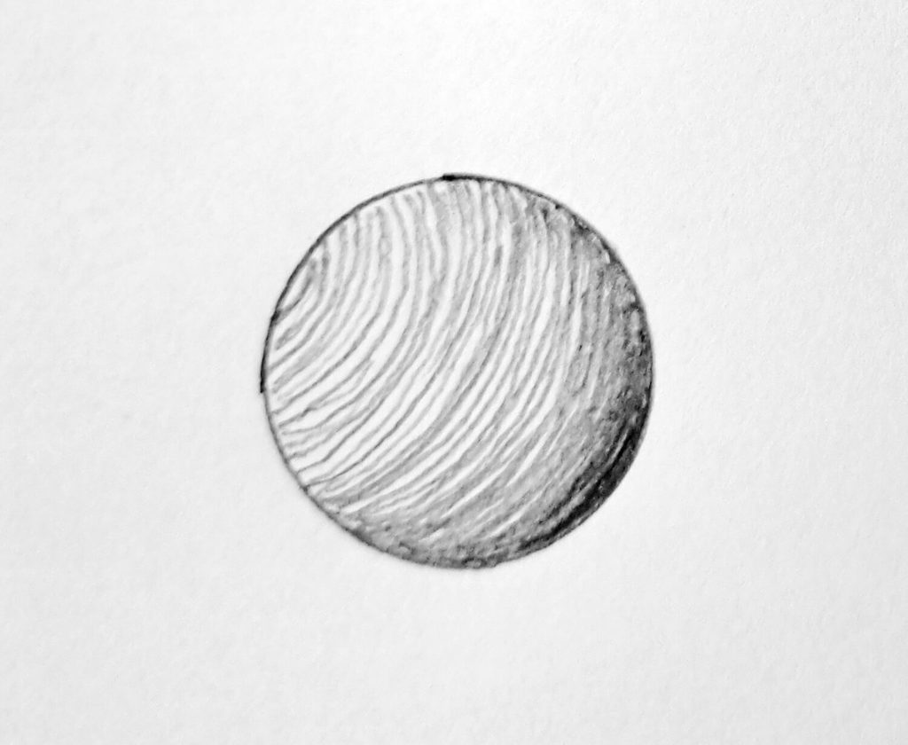
Contouring is one of the most useful techniques when you’re trying to make a shaded object look three-dimensional.
Instead of drawing your marks in an arbitrary direction, you curve them so they follow the form of the subject.
Imagine shading a sphere. Straight horizontal lines can create tone, but curved lines that follow the sphere’s surface can reinforce its roundness. Your eye reads the direction of those marks as information about the object’s shape.
The same idea can be applied to almost any subject.
For a cylindrical arm, the lines might curve around the form. For a rounded shoulder, they can follow the turning surface. On an animal, contouring can help describe the direction in which fur lies across the body.
Practice Exercise
Draw three simple shapes:
- A sphere
- A cylinder
- A cone
Shade each one using lines that follow its surface (contouring).
Don’t worry about making a finished drawing. The exercise is about teaching your hand to think about form while you shade.
5. Stippling
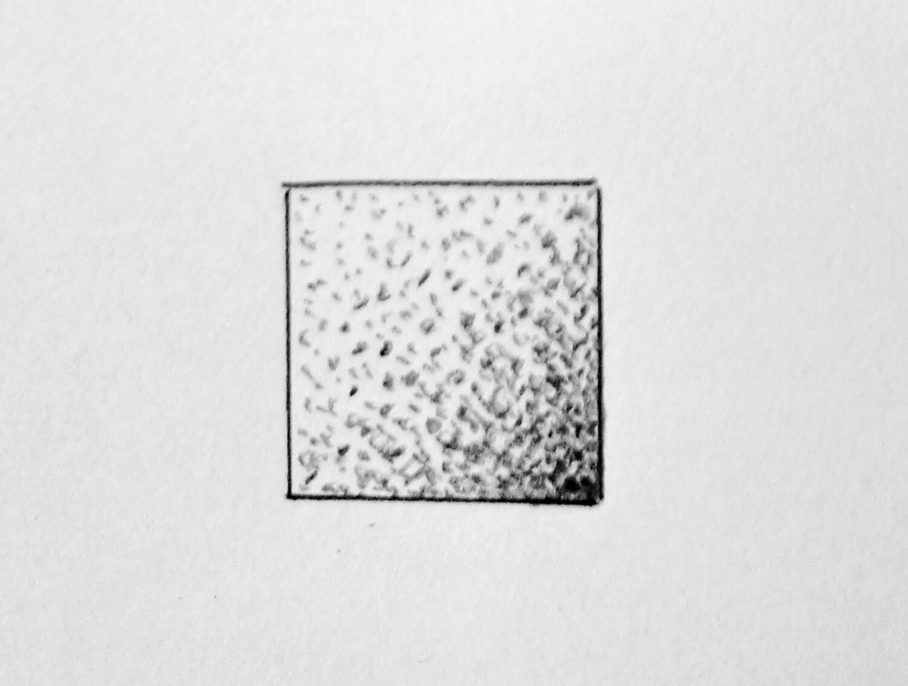
Contouring was about lines that follow the form; stippling replaces lines with dots.
The principle behind the technique is that a large concentration of dots creates a darker area, while fewer dots leave more of the paper visible and create a lighter value.
If you’re accustomed to shading an area with pencil strokes, stippling can feel painfully slow. But that’s also what makes it useful. You’re forced to build the value gradually and make deliberate decisions about where every mark goes.
You can make the dots with the point of a sharp pencil. Keep the pressure relatively consistent when you’re trying to create an even texture, then change the density of the dots to control the value.
For lighter areas, spread the dots apart. As the form turns into shadow, gradually bring them closer together.
Stippling can produce beautiful results in botanical illustration, scientific drawing, and highly detailed work. It can also be used for skin, stone, sand, textured surfaces, and many other subjects.
6. Blending
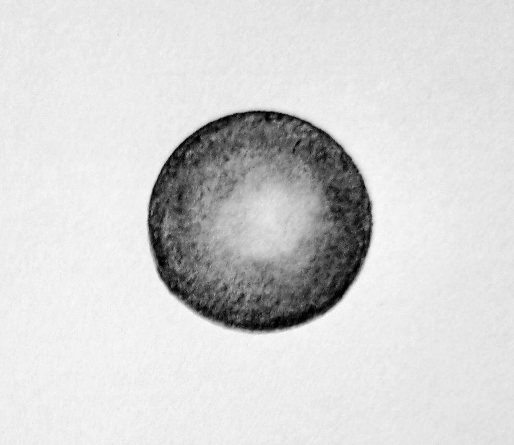
If you’re looking for a smoother shade or tone, blending is necessary by building graphite on the paper and then softening the marks by rubbing or blending them.
You may use a blending stump, tissue, cloth, or other appropriate tool depending on the effect you’re after. Blending is particularly useful for subjects with relatively smooth surfaces.
Skin is an obvious example. So are polished objects, glass (how to draw a glass of water), smooth ceramic, soft clouds, and areas where you need a gradual transition from light to shadow.
However, blending works best when you treat it as part of the process rather than as a magic eraser for rough shading.
Build your graphite first to establish the general value before blending.
If you rub a very light layer of graphite across the paper, you may simply create a pale gray haze. If you build a controlled layer first, blending can unify the marks and create a smoother tone.
The type of paper is also a determining factor. Graphite behaves differently depending on the surface texture. A paper with more tooth holds graphite differently from a very smooth surface, which can change both the appearance of the marks and how easily they blend.
7. Short Dashes
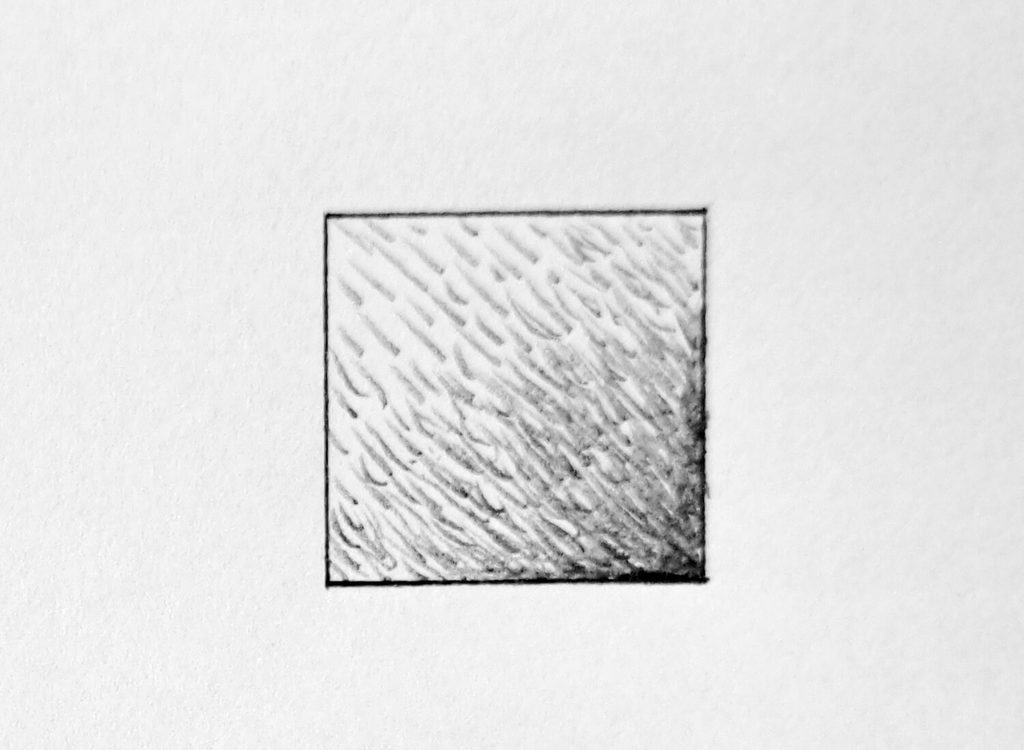
Short dashes are exactly what they sound like: small individual strokes used repeatedly to create tone and texture.
They’re particularly useful when long lines would feel too obvious or when you want a more broken, organic surface.
You can place the dashes close together for darker areas and farther apart for lighter ones. You can also vary their length, angle, and pressure.
This makes the technique surprisingly versatile.
Short dashes can suggest hair, fur like this koala drawing, rough surfaces, grass, feathers, wrinkles, and many other textures. They can also be used simply as a shading method when you don’t want a completely continuous tone.
Try making a small square with horizontal dashes. Then make another using diagonal dashes. In a third, vary the direction randomly but keep the overall density controlled.
You’ll realize how much the character of the surface changes even when the overall value remains similar.
8. Scribbles
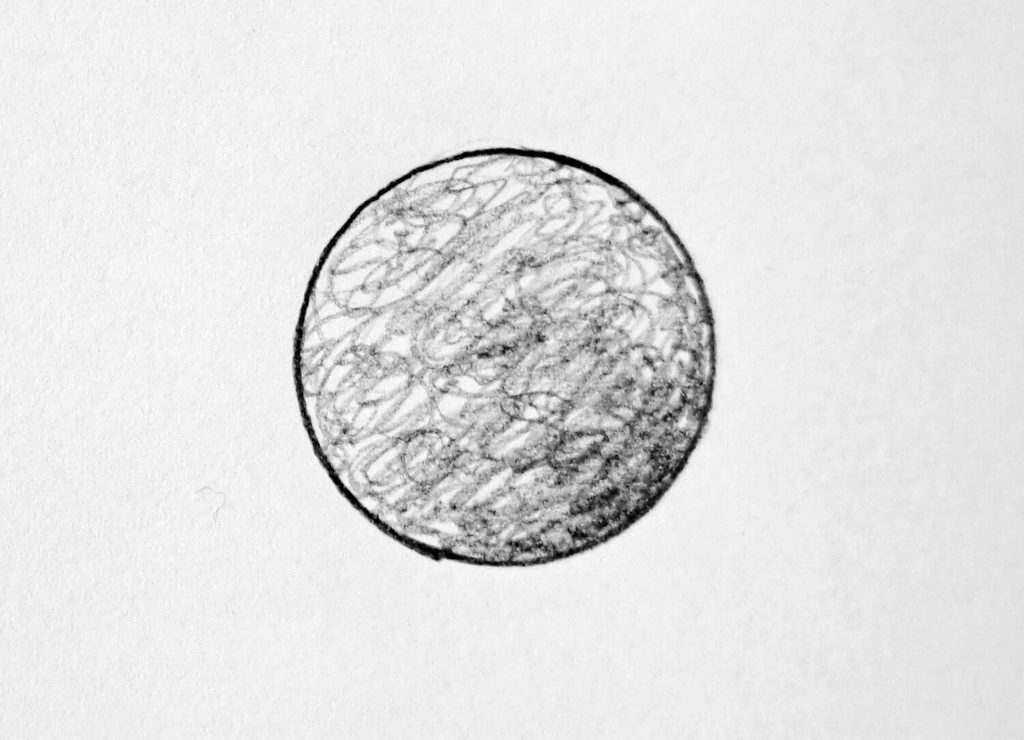
For shading, controlled scribbling means making continuous, overlapping movements rather than repeatedly lifting the pencil after every stroke.
The movement might consist of loose loops, irregular curves, or small tangled marks. What matters is that you’re controlling the density of graphite rather than simply drawing randomly.
A lighter scribble creates a lighter value. More concentrated scribbling produces a darker one.
This technique can be particularly effective for rough textures and organic subjects. It can also give a drawing a lively, energetic quality that carefully controlled straight lines sometimes lack.
However, if you’re trying to shade a particular form, the marks still need to respond to its shape, lighting, and surface.
9. Zigzag
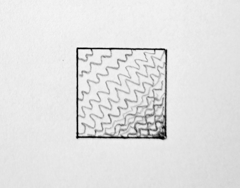
Zigzag shading uses a continuous back-and-forth movement to create a connected pattern of angular strokes.
Imagine drawing a series of connected “V” shapes without repeatedly lifting the pencil from the paper. By changing the spacing, pressure, and size of the zigzags, you can create different values and textures.
It’s an efficient technique because you can cover an area relatively quickly. A widely spaced zigzag can leave plenty of paper showing through. Tighten the movement and the graphite becomes more concentrated, producing a darker tone.
You can also vary the size of the zigzag. Small, tight movements create a denser texture, while broader movements can produce a looser appearance.
Zigzag shading can be useful for rough surfaces, quick sketches, and areas where you want visible movement in the marks.
It also makes a good exercise for learning pencil control because your hand has to maintain a repeated rhythm while changing direction.
Try drawing a gradual value scale using one continuous zigzag line. Start with wide, light movements and progressively tighten the pattern as you move toward the darkest end.
You’ll quickly discover that your hand can control tone through movement as well as pressure.
10. 3s
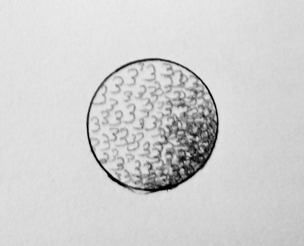
The 3s technique uses repeated small “3” or double-curve shapes to build tone.
The marks overlap, creating a continuous pattern that can be used to cover an area. Like circulism and scribbling, it produces a less rigid surface than conventional straight-line hatching.
Start with very light pressure and repeat the 3-shaped movement across the area you’re shading. As you need more darkness, make the marks closer together or add another layer.
The individual marks can remain visible, or you can soften them later if the drawing calls for a smoother surface.
What makes this technique useful is the combination of repetition and variation. The repeated movement gives you control, while the curved shape keeps the shading from becoming overly uniform.
It’s also worth experimenting with the size of the marks. Tiny 3s can produce a fairly dense texture. Larger ones create a more open, expressive pattern.
As with scribbling, the technique becomes much more effective when the marks relate to the form you’re drawing. Follow the direction of the surface rather than covering everything with the same pattern.
How to Choose the Right Shading Technique
Learning ten techniques doesn’t mean you have to choose one and stick with it.
In practice, artists often combine methods. A drawing might use contouring to establish the direction of a form, hatching to build the main shadows, blending to soften selected transitions, and short dashes to describe texture.
A smooth cheek may benefit from controlled tonal shading and selective blending. A rough stone might respond better to scribbles, short dashes, or stippling. Hair may need directional strokes. A strongly graphic sketch might look better with hatching and cross-hatching left clearly visible.
Therefore, before reaching for a darker pencil, look at the subject and identify the lightest areas, middle values, and darkest areas. Shading techniques are simply different ways of controlling the distribution of those values.
Lastly, make sure you check out my list of 44 Useful Drawing Cheat Sheets for quick reference.
Conclusion
Here’s the thing:
You don’t need to use all ten techniques in every drawing.
In fact, some of your best drawings may rely heavily on only two or three. What matters is understanding what each technique can do, then choosing the mark that suits the form, texture, and lighting in front of you.
I hope you’ve enjoyed today’s tutorial. If you have, consider helping me amplify its reach by sharing with your friends on Facebook, Pinterest, or any platform of your choice.
All of which I’d appreciate it.