
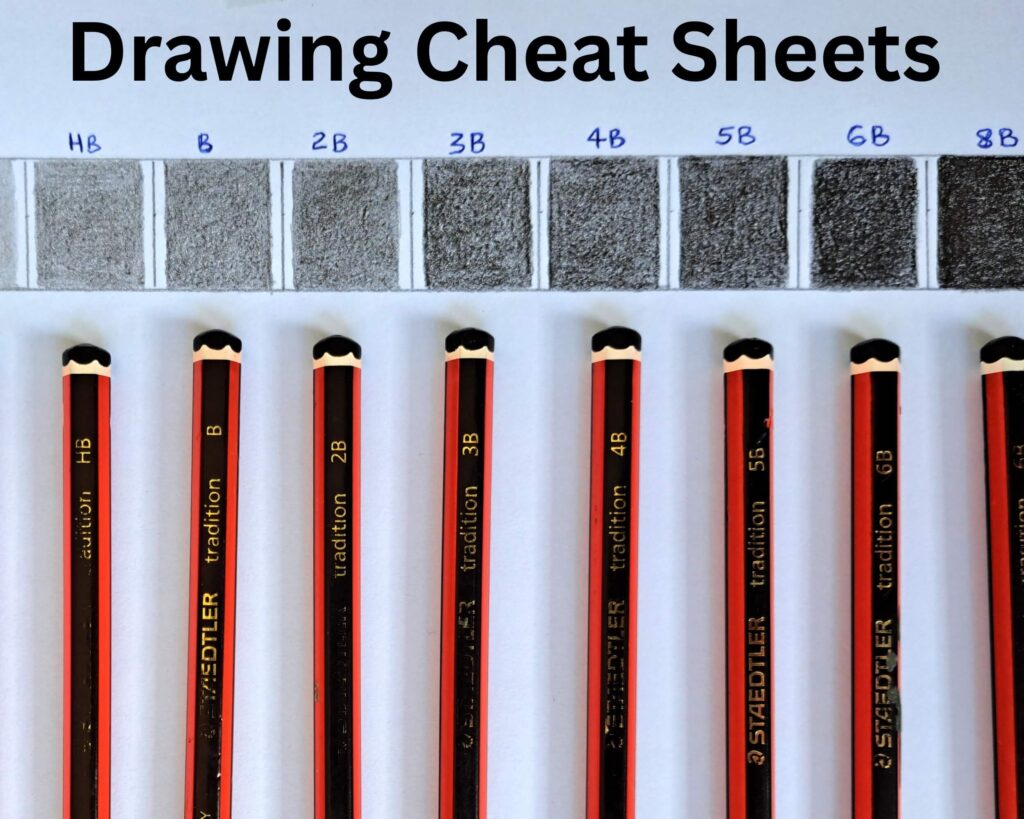
Did you know that many professional artists still keep drawing reference sheets within arm’s reach while they work?
It’s not because they’ve forgotten the basics.
It’s because great artists understand that drawing isn’t about memorizing every proportion, perspective rule, or pencil grade. It’s about knowing where to look when you need a quick reminder.
Think about a chef following a favorite recipe or a musician keeping sheet music nearby. Neither sees it as a shortcut. It’s simply a practical way to work efficiently while staying focused on the creative process.
Drawing cheat sheets serve the same purpose.
They condense essential information into easy-to-read visual references that help you spend less time second-guessing yourself and more time drawing.
Whether you’re sketching portraits, animals, botanical illustrations, flowers, landscapes, or still life, you’ll constantly encounter the same questions.
- Which pencil should I use?
- Why do my shadows look flat?
- Why does my perspective feel off?
- Why do my faces never look quite right?
Having reliable reference guides for these common challenges makes learning far less frustrating.
Another advantage of cheat sheets is that they help you build good habits. The more often you glance at a value scale, compare your drawing against facial proportions, or check a perspective guide, the more naturally those concepts become part of your workflow.
Eventually, you’ll rely less on the cheat sheets because the information becomes second nature.
This guide (a 3-part in-depth resource) brings together some of the most useful drawing cheat sheets every artist should know. Instead of simply presenting charts, we’ll also explore why each one matters, how to use it effectively, common mistakes to avoid, and simple exercises that help you put each concept into practice.
Let’s just say, it’s going to be a lengthy resource! That’s why you should bookmark it, pin it on Pinterest, Facebook, or anywhere you can access it easily.
Let’s start with the foundations on which every successful drawing is built.
Part 1: Drawing Foundations
Before worrying about realistic portraits or dramatic shading, it’s important to develop a solid understanding of the tools and techniques that make every drawing possible.
These first cheat sheets cover the building blocks you’ll use in almost every sketch, regardless of your subject or skill level.
1. Graphite Pencil Grades Cheat Sheet
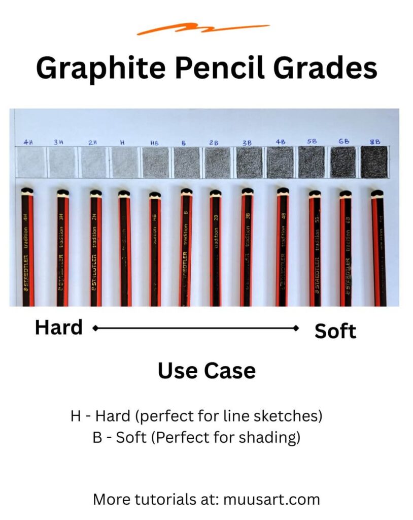
Walk into an art supply store, and you’ll probably find dozens of graphite pencils ranging from 9H to 9B.
At first glance, the labels seem confusing, especially if you’re used to drawing with a single school pencil. In reality, those letters and numbers simply describe how hard or soft the graphite is.
Hard pencils create lighter, sharper marks because they contain more clay and less graphite. Soft pencils contain more graphite, making them darker, smoother, and easier to blend.
Quick Reference
| Pencil | Best For |
| 4H to 9H | Technical drawing, extremely light guidelines |
| 2H to H | Construction sketches and clean outlines |
| HB | Everyday sketching |
| B | General shading |
| 2B | Richer values and line work |
| 4B | Deep shadows |
| 6B | Strong contrast and expressive drawings |
| 8B to 9B | The darkest values and finishing touches |
Many beginners believe they need every pencil grade available.
In practice, most realistic graphite drawings can be completed with just four pencils: HB, 2B, 4B, and 6B. Learning how to control pressure often matters more than owning a large collection.
Common Mistake
Trying to achieve dark shadows by pressing harder with an HB pencil. Heavy pressure damages the paper and produces shiny graphite instead of rich, dark tones.
It’s much better to switch to a softer pencil.
Five Minute Practice
Draw eight small squares. Shade each one using a different pencil grade if you have several available. Compare how each pencil feels and how dark it can become without pressing hard.
2. Paper Surface Cheat Sheet
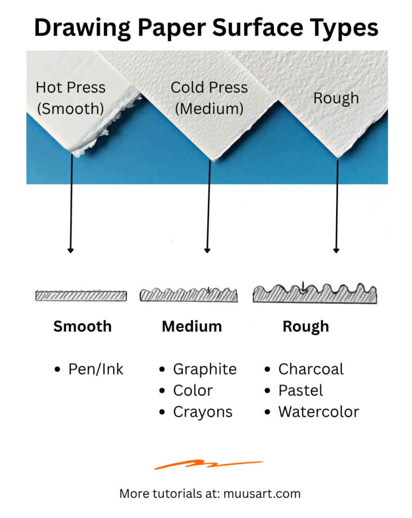
Artists often spend a lot of time choosing pencils but overlook the paper they’re drawing on. The surface texture, sometimes called the paper’s tooth, affects everything from blending to detail.
A smooth paper allows pencils to glide easily and produces crisp lines, making it ideal for portraits and detailed realism. Rougher paper grabs more graphite, creating stronger textures that work well for expressive sketches and landscapes.
Quick Reference
| Paper Type | Best For |
| Smooth (Hot Press) | Detailed realism, portraits |
| Medium Tooth (Cold Press) | General drawing |
| Rough | Texture, expressive work |
| Bristol Board | Fine details, illustration |
| Mixed Media | Combining graphite with ink or colored pencil |
You don’t need expensive paper when learning. A good quality sketchbook with medium tooth offers plenty of flexibility while helping you understand how graphite behaves.
Common Mistake
Using rough paper for highly detailed portraits can make smooth skin difficult to achieve because the graphite settles into the paper’s texture.
Five Minute Practice
Sketch the same simple sphere on two different papers if possible. Notice how differently the graphite blends and how easily you can create smooth gradients.
3. Pencil Grip Cheat Sheet
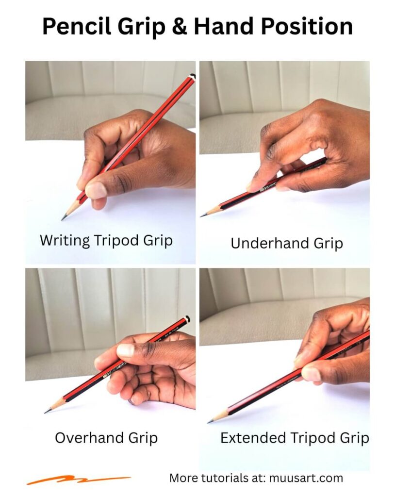
Many beginners hold a drawing pencil exactly like they’re writing. While this works for small details, it limits arm movement and often leads to stiff, scratchy drawings.
Artists switch between several grips depending on what they’re trying to accomplish.
Common Pencil Grips
Writing Grip
Ideal for detail work, small features, and precise outlines.
Overhand Grip
Excellent for broad shading, loose sketches, and expressive marks. It encourages drawing from the shoulder instead of the wrist.
Extended Grip
Holding the pencil farther back naturally produces lighter strokes and helps prevent overworking the drawing.
Underhand Grip
Useful for large gestures and smooth, flowing lines.
Learning multiple grips gives you greater control and makes long drawing sessions more comfortable.
Common Mistake
Holding the pencil too close to the tip throughout the entire drawing often results in excessive detail too early.
Five Minute Practice
Draw twenty straight lines using each grip. Notice how your control and line quality change.
4. Pencil Pressure Cheat Sheet
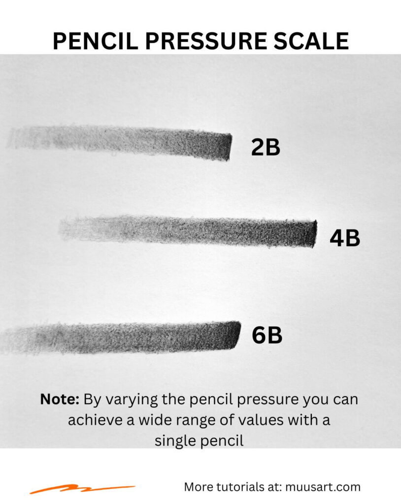
One of the biggest differences between beginner and experienced artists isn’t the pencil itself. It’s how they control pressure.
Imagine a volume knob rather than an on-and-off switch. Every slight change in pressure creates a different value.
Pressure Scale
| Pressure | Appearance | Best Use |
| Very Light | Barely visible | Construction lines |
| Light | Soft gray | Initial shading |
| Medium | Midtone | Developing form |
| Heavy | Dark gray | Core shadows |
| Maximum | Rich black | Final accents only |
Professional artists usually build values gradually instead of immediately pressing hard.
Light layers produce smoother gradients and leave room for adjustments later.
Common Mistake
Using maximum pressure too early makes correcting mistakes difficult and limits your value range.
Five Minute Practice
Draw a long rectangle and slowly transition from white to black without lifting your pencil. Aim for the smoothest possible gradient.
5. Line Weight Cheat Sheet
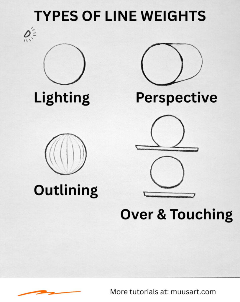
Not every line deserves equal attention.
Line weight refers to the thickness and darkness of your lines. Changing it strategically can create depth before you even begin shading.
Think of comic artists. They often use thicker outlines around important subjects and thinner lines for distant objects. Realistic artists use the same principle more subtly.
General Rules
Use thicker lines for:
- Foreground objects
- Areas hidden behind another object
- Deep shadows
- Important contours
Use thinner lines for:
- Distant objects
- Brightly lit edges
- Fine details
- Delicate textures
You don’t have to outline everything equally. In fact, some of the strongest drawings allow certain edges to disappear entirely where light washes them out.
Common Mistake
Sketching every object with the same dark outline makes drawings appear flat and cartoonish.
Five Minute Practice
Draw three overlapping circles. Vary the line weight so the front circle appears closest without adding any shading.
6. Basic Shapes Cheat Sheet
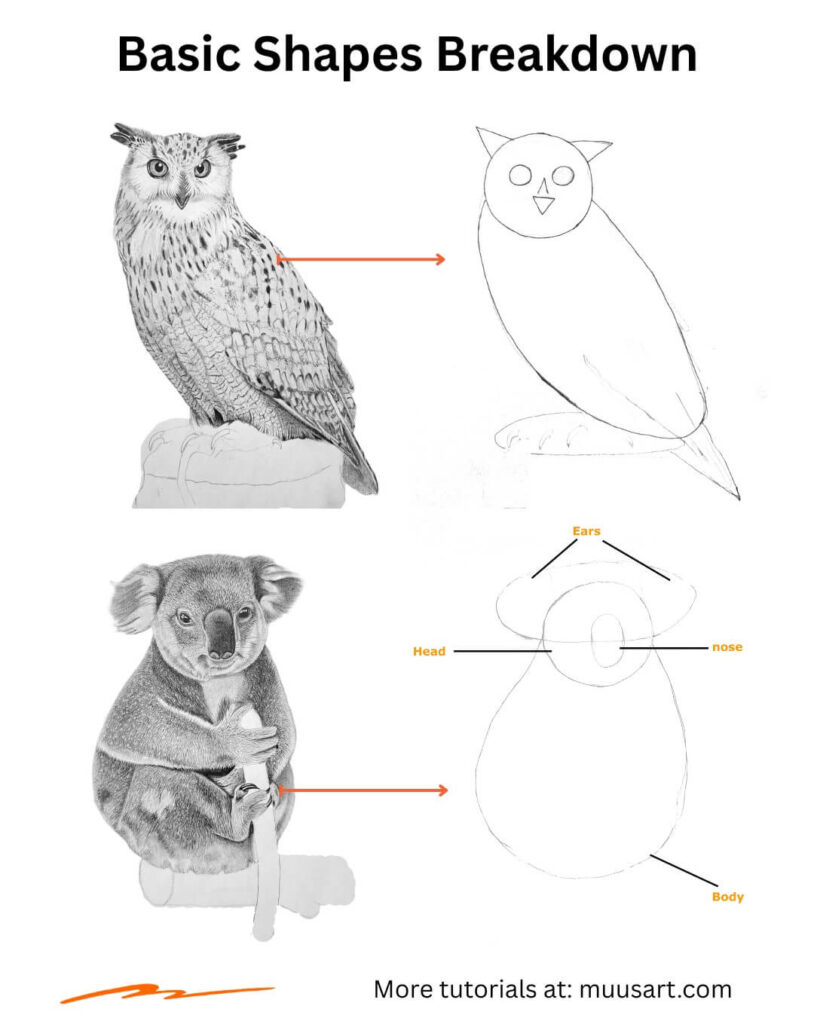
One of the biggest breakthroughs for any artist comes from realizing that almost everything can be simplified into a few basic forms.
Some of the common shapes include spheres, cylinders, boxes, cubes, prisms, circles, cones, and teardrops.
Breaking complicated subjects into simple forms helps you solve proportion, perspective, and lighting before getting distracted by details.
Common Shape Breakdown
| Subject | Simple Forms |
| Head | Sphere and jaw block |
| Tree | Cylinder and sphere |
| Bird | Ovals and cones |
| Car | Boxes and cylinders |
| Cat | Spheres and cylinders |
| Cup | Cylinder |
| Rose | Spiral and overlapping ovals |
| Mushroom | Dome and cylinder |
This approach also makes correcting mistakes much easier because adjusting a sphere is simpler than fixing dozens of detailed lines.
Common Mistake
Jumping directly into details before establishing the overall structure often leads to distorted proportions.
Five Minute Practice
Look around your room and choose five everyday objects. Reduce each one to only circles, boxes, cylinders, and cones.
7. Construction Lines Cheat Sheet
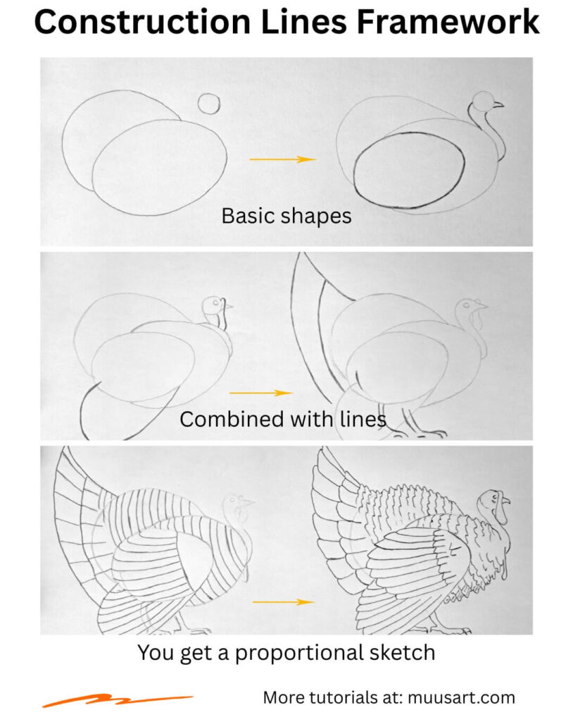
Construction lines are the hidden framework beneath a finished drawing. They act like the scaffolding around a building. Once the structure is complete, most of them disappear, but without them, everything becomes much harder to build accurately.
Many beginners avoid construction lines because they want their sketches to look clean from the beginning.
Ironically, this often leads to repeated erasing and distorted proportions. Professional artists usually fill the page with light guidelines before committing to darker outlines.
Good construction lines should be:
- Light enough to erase easily.
- Simple rather than detailed.
- Focused on placement and proportion.
- Drawn confidently instead of scratching the paper with short, hesitant strokes.
Remember that construction lines are meant for you, not anyone else. They don’t need to look pretty. Their only job is to help you place forms correctly.
Common Mistake
Pressing too hard during the construction stage makes guidelines difficult to erase and encourages drawing details before the overall proportions have been checked.
Five Minute Practice
Choose a simple object like a mug, apple, or shoe. Spend two minutes drawing only its construction lines using basic shapes. Resist the urge to add details until the structure feels correct.
Putting These Foundations Together
Although each cheat sheet focuses on a different concept, they all work together every time you draw.
You might begin with light construction lines using an H or HB pencil, block in the subject with simple shapes, adjust your line weight to create depth, then gradually build values by controlling pencil pressure.
Even your choice of paper influences how smoothly those values blend.
Mastering these fundamentals won’t instantly make every drawing realistic, but they provide a dependable framework that makes every new subject easier to tackle. Once these habits become second nature, you’ll spend less time fixing avoidable mistakes and more time enjoying the creative process.
In the next section (part 2), we’ll explore the cheat sheets that transform flat sketches into convincing three-dimensional drawings by mastering light, shadow, values, and shading techniques.
To be continued…