
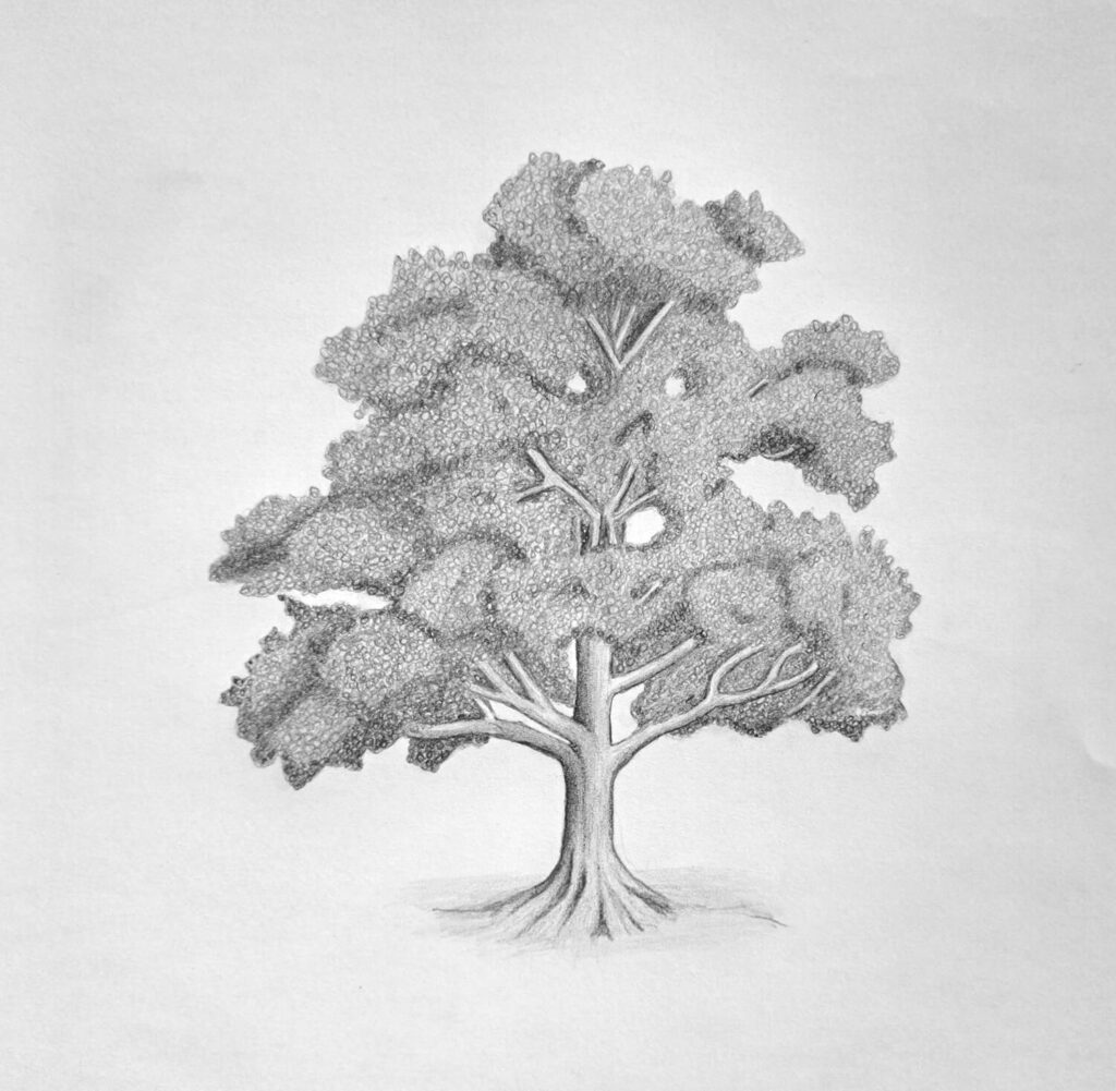
How do you draw a tree without drawing hundreds or thousands of individual leaves?
That’s one of the first questions that comes up when beginners attempt to draw a tree. The foliage can quickly become a collection of random pencil marks, or worse, a solid mass of graphite that makes the artwork look flat.
To solve this, you need to know where to place your shadows, how to build up the different tones, and where a little texture makes the biggest difference.
You also don’t need to give every section of the tree the same amount of detail.
In this step-by-step tutorial, we’ll draw a tree using simple pencil shading techniques, gradually developing the foliage before adding texture.
Let’s start:
5 Steps for Drawing a Realistic Tree for Beginners
1. Outlining the Tree
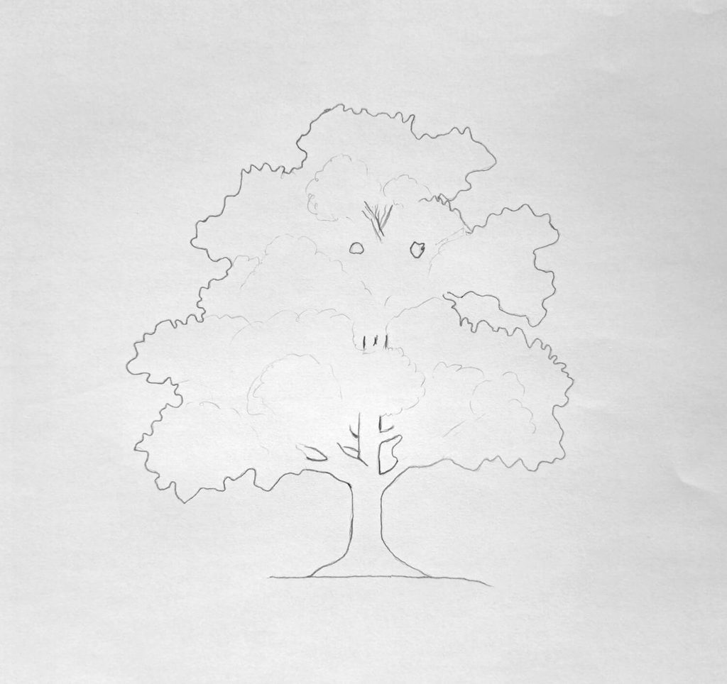
Start with a light outline of the tree’s overall shape. Pay attention to the width and height of the crown (always use a reference). Look at the outer edges of your reference and notice how some foliage clusters stick out farther than others.
Next, sketch the trunk, keeping it wider at the bottom and gradually narrowing it as it rises into the crown. Add the main branches, making sure they spread in slightly different directions.
Some should curve, while others extend outward before disappearing behind the foliage.
Keep your pencil lines light because you’ll be refining the shapes as the shading develops. The main thing is to get the proportions right and leave enough room for the foliage to spread around the branches.
2. Blocking in the Shadows (Mild Shadows)
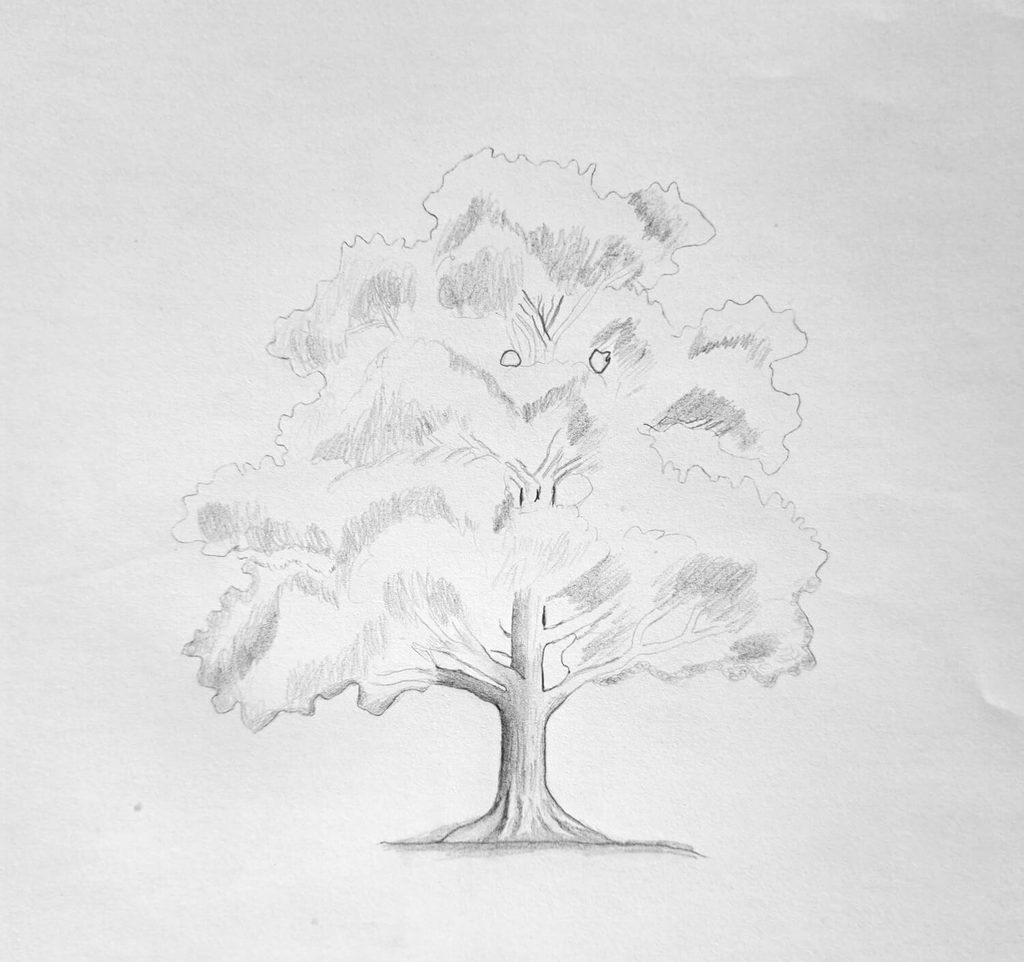
With the outline established, start blocking in the shadow areas of the crown. Look for the darker sections between overlapping clusters of foliage, particularly underneath the upper sections and around the inner parts of the tree.
You can observe my sketch above to see how I did it.
Preferably, use a light HB pencil shading. Ideally, this is the first layer of shading. You want to create some separation between the foliage clusters without making them too dark just yet.
Leave the sections that catch more light relatively untouched. Those lighter spaces will help create contrast later, so don’t fill them in unnecessarily.
3. Shading the Midtones
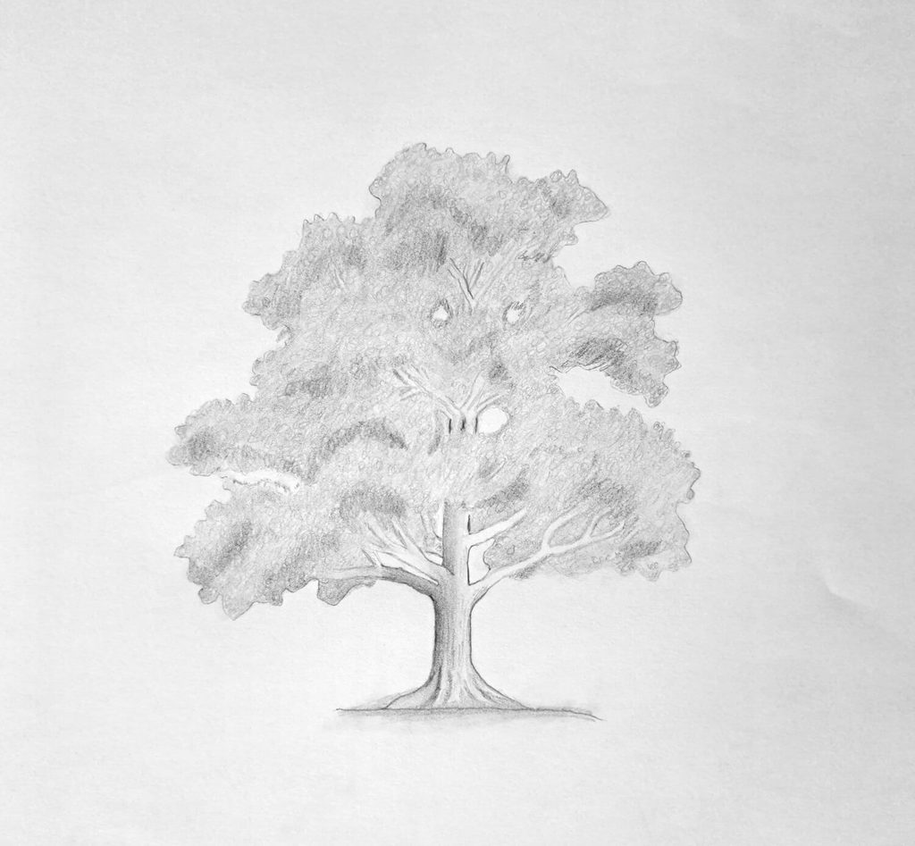
Now build on those initial shadows by adding the midtones. These are the areas that give the foliage its volume and help distinguish one cluster from another.
Again, using an HB pencil, work gradually, adding another layer of graphite to the areas that need more depth. Use loose, slightly curved strokes. Vary your pencil pressure as you move around the crown, keeping some sections light and allowing others to become moderately dark.
A little extra shading in these areas can make the lighter sections stand out and give the crown a more layered appearance. At the same time, avoid making every cluster equally dark.
Trees have plenty of variation in the way their foliage catches light.
Step back occasionally and check the overall balance. Does the crown have distinct lighter and darker areas, or is everything beginning to blend?
Make small adjustments before moving on to the texture.
4. Shading Texture
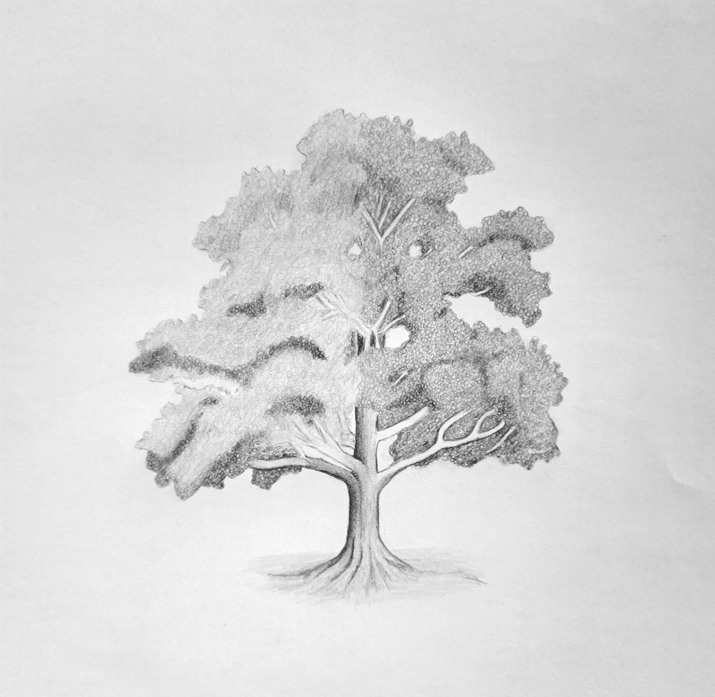
In my illustration above, the right side of the crown has visible texture, while the left side remains relatively smooth. I did this intentionally so that you can observe the difference.
To create the illusion of leaf texture, use short, irregular circular strokes to suggest groups of leaves. Vary their size, direction, and spacing. Some can be darker and closer together, particularly around the shadowed areas, while others should be lighter and more scattered.
One thing worth remembering is that you don’t have to draw individual leaves to make foliage recognizable. It’s easier to suggest them through small groups of marks, allowing the viewer’s eye to interpret the shapes.
5. Final Tree Drawing: Shading the Trunk and Visible Branches
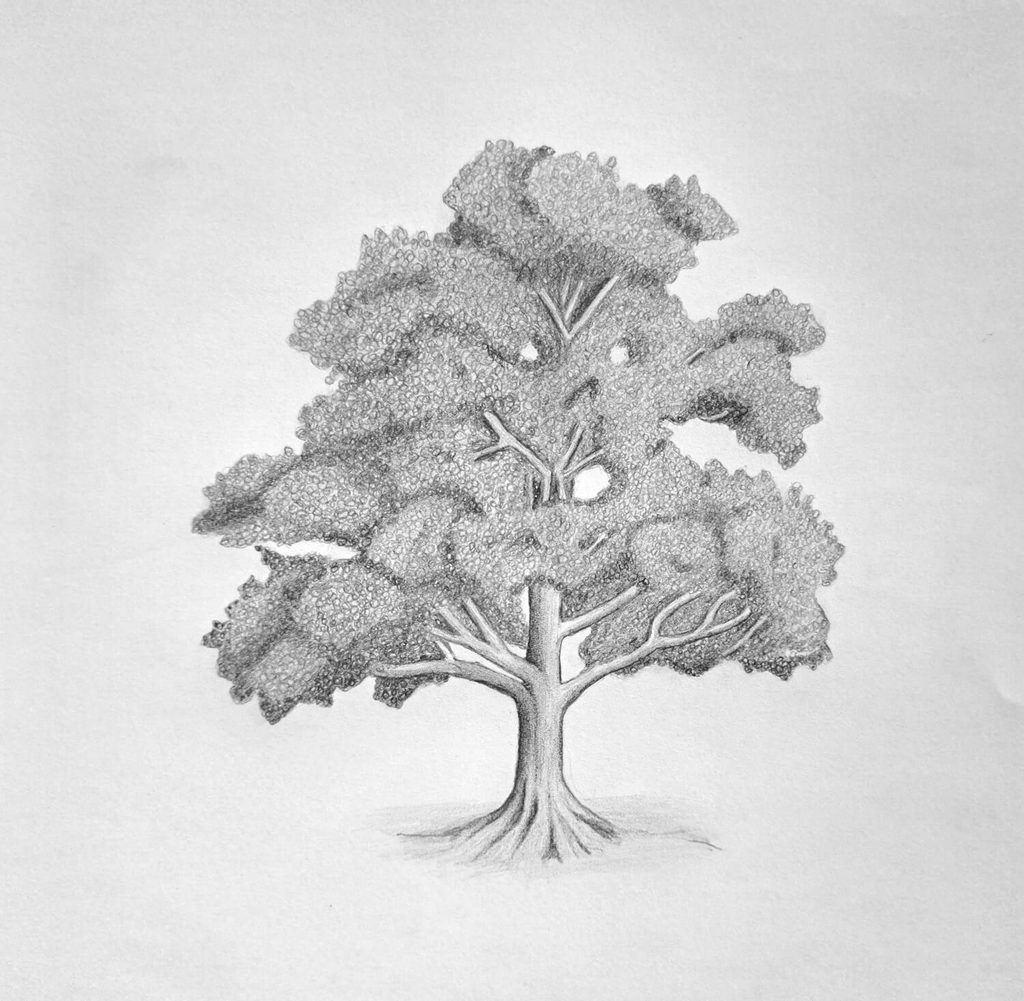
With the foliage taking shape, finish the trunk and the visible branches. Start by adding darker shading along one side of the trunk, gradually blending it into the lighter areas. This helps give the trunk a rounded appearance.
It is the same idea we did on the drawing and shading cylinders.
Build up the graphite gradually, following the direction of each branch as it extends into the crown.
For the bark, add a few irregular lines running along the trunk and larger branches. Vary their length and darkness, concentrating more detail in selected areas. You don’t need to draw dozens of lines from top to bottom.
A handful of well-placed marks will suggest the rough surface without distracting from the rest of the drawing.
Finally, check the smaller visible branches and strengthen their shading where necessary. Keep them relatively thin as they extend outward, and make sure they appear to emerge naturally from the thicker branches.
You may also be interested in learning how to draw a single leaf with water droplets.
Conclusion
To recap, the foliage is usually where a tree drawing gets tricky.
Too many pencil marks, and the crown becomes messy. Too much smooth shading, and it can lose the appearance of leaves altogether. Finding a balance between the two takes a little practice.
I’d be interested to see how your version turns out, particularly if you experiment with different amounts of foliage texture.
Share your drawing with other artists, or save and pin this tutorial so you can come back to the steps when practicing another tree.