
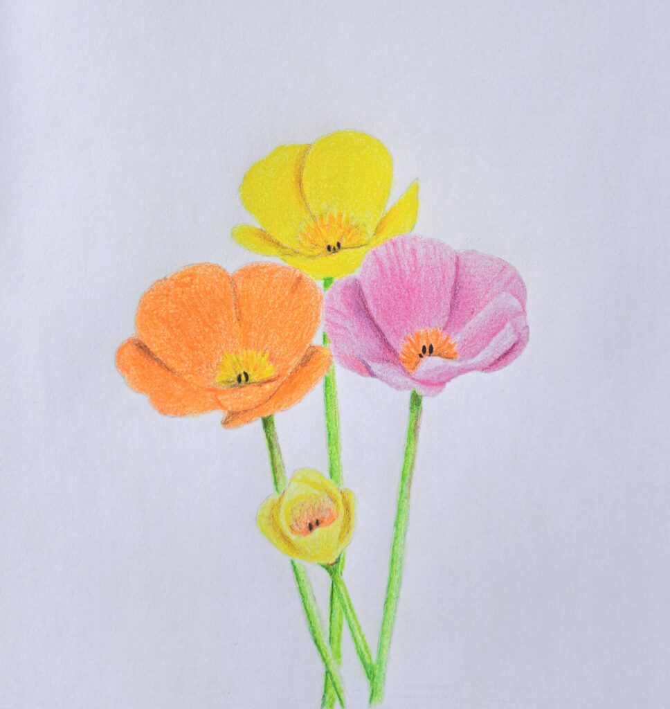
When you’re having a bad day, stunning poppy flowers can almost always brighten it.
They come in an incredible variety of colors, from white, pink, and yellow to brilliant orange and everything in between, making them one of the most cheerful flowers to admire and draw.
Beyond their beauty, poppies carry deep symbolism and are widely recognized during memorial and remembrance events around the world. They’re flowers that can tell a story while adding a burst of color wherever they grow.
Personally, I find endless inspiration simply from seeing them bloom.
That’s exactly why I’m excited to draw these colorful florals. Unlike many of my previous tutorials that focused on graphite, this time I’ll show you my complete process for drawing poppy flowers with colored pencils, building vibrant layers step by step to create rich, realistic petals full of depth and life.
5 Step Process for Drawing Poppy Flowers with Color Pencils
Draw the Line Sketch Using a Graphite Pencil
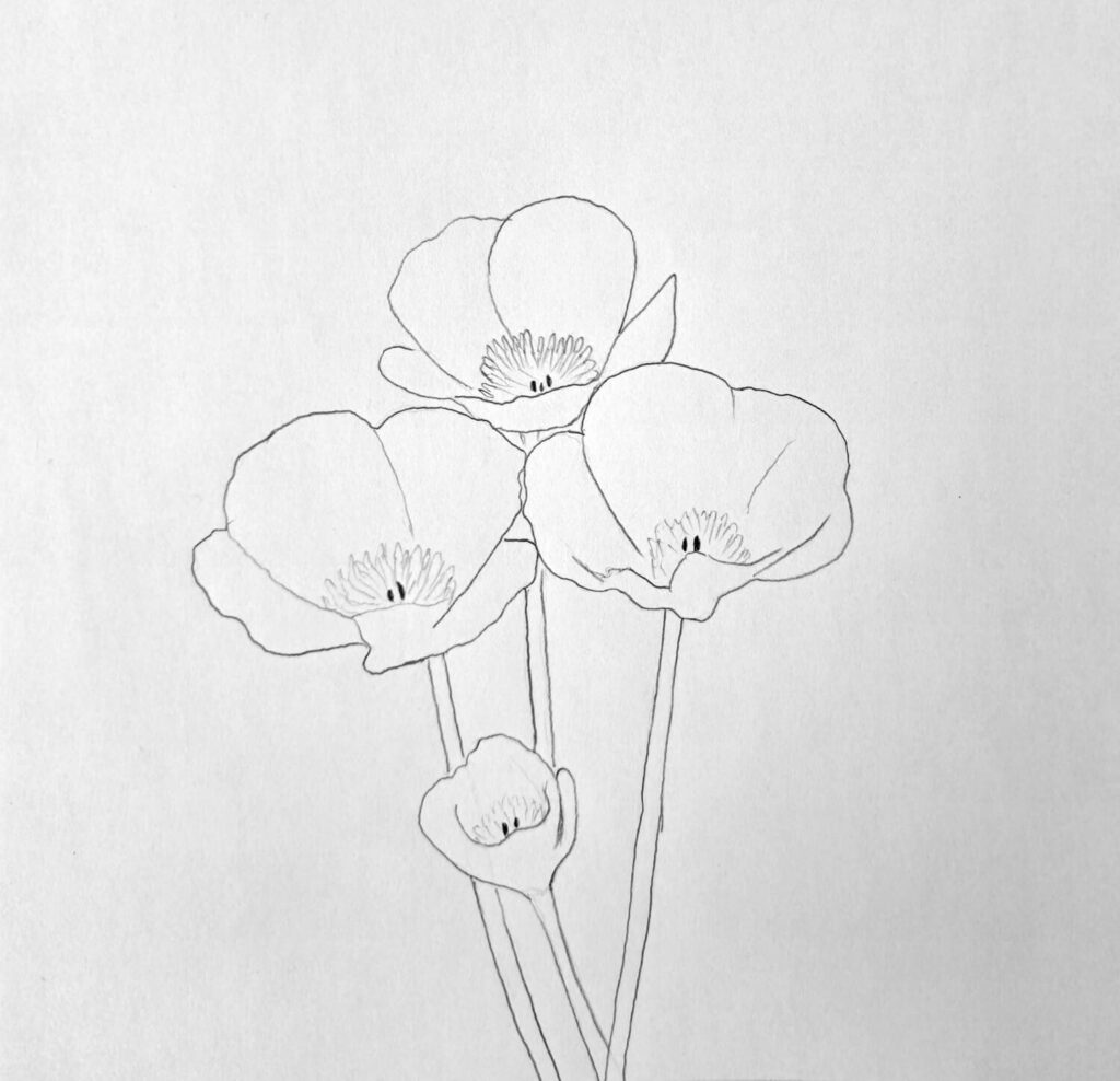
Every colored pencil drawing starts with a solid sketch, and poppy flowers are no exception. Before introducing any color, I lightly sketched three fully open flowers and one slightly closed bloom, each supported by a long, slender stem.
I intentionally left out the leaves so the flowers would become the focal point of the composition.
When sketching poppies, I like to begin with the largest shapes before refining the details. This makes it much easier to establish the size and position of each flower without getting caught up in individual petals too early.
Once the overall composition looked balanced, I gradually added the petals. Poppies have soft, delicate petals with naturally wavy and uneven edges, so I avoided making them too symmetrical.
Try to keep the graphite lines as light as possible throughout the sketching.
Colored pencils are transparent enough that heavy graphite can remain visible beneath the color, especially in lighter flowers like yellow and pink. A clean, light sketch gives you much more flexibility during the coloring stages.
I deliberately made my lines darker so that they’re visible on screen, but I’ll have to dab on them later.
Basic Light Coloring
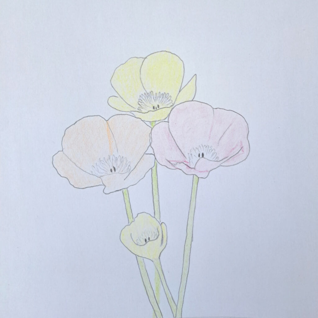
With the sketch complete, it’s time to begin coloring. At this stage, the goal is simply to establish a light foundation that can be built upon with additional layers.
The petals of the first flower receive a light orange layer, the second flower is colored yellow, and the third flower is filled with a soft pink.
For the slightly closed bud, I used a pale yellow to distinguish it from the fully open blooms while keeping the composition harmonious.
Using light pressure is important here.
Instead of trying to fill every area with rich color immediately, I gradually covered each petal with smooth, even strokes. This preserves the paper’s texture and leaves plenty of room for additional layers later.
I also applied a light green base to each stem. At this point, everything should look fairly soft and slightly washed out, which is exactly what you want before adding shadows and richer colors.
Erase the Graphite Outline
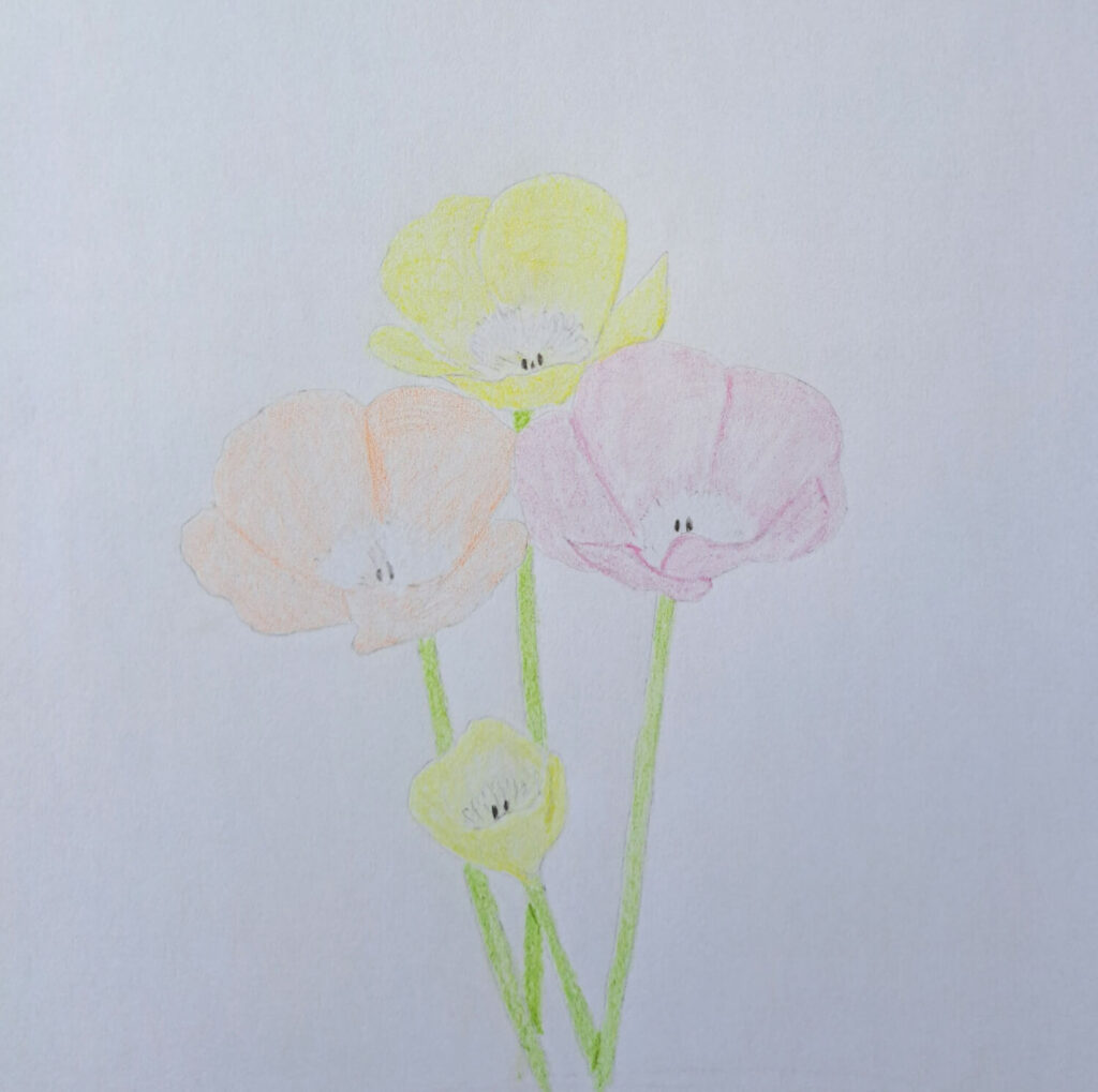
Once the first layer of colored pencil was in place, I carefully erased the remaining graphite outlines. Since the colored pencil had already established the shapes, the pencil lines were no longer necessary.
Removing the graphite at this stage gives the flowers a much softer, more natural appearance. Instead of relying on dark outlines to separate the petals, the colors themselves begin defining each shape.
A kneaded eraser works especially well because it gently lifts the graphite without damaging the paper or removing too much of the colored pencil underneath.
If a little color is lifted during the process, don’t worry. The next layers will easily restore it.
Coloring the Shadows with Complementary Colors

Now the flowers begin to develop depth and dimension. Rather than making shadows darker with the same color alone, I used complementary colors to create richer and more natural-looking shading.
For the orange petals, I introduced subtle touches of blue in the deepest folds before layering more orange over them. The yellow petals benefit from gentle violet shadows, while the pink flower gains depth with small amounts of green in the darker areas.
The key is to apply these complementary colors lightly. They shouldn’t overpower the petals but instead create subtle variations that make the flowers appear more vibrant. I also darkened the areas where petals overlap since these naturally receive less light.
As the shadows develop, the flowers begin to look much less flat. Even small changes in value can dramatically improve the illusion of depth.
Deepen the Colors by Shading Another Layer
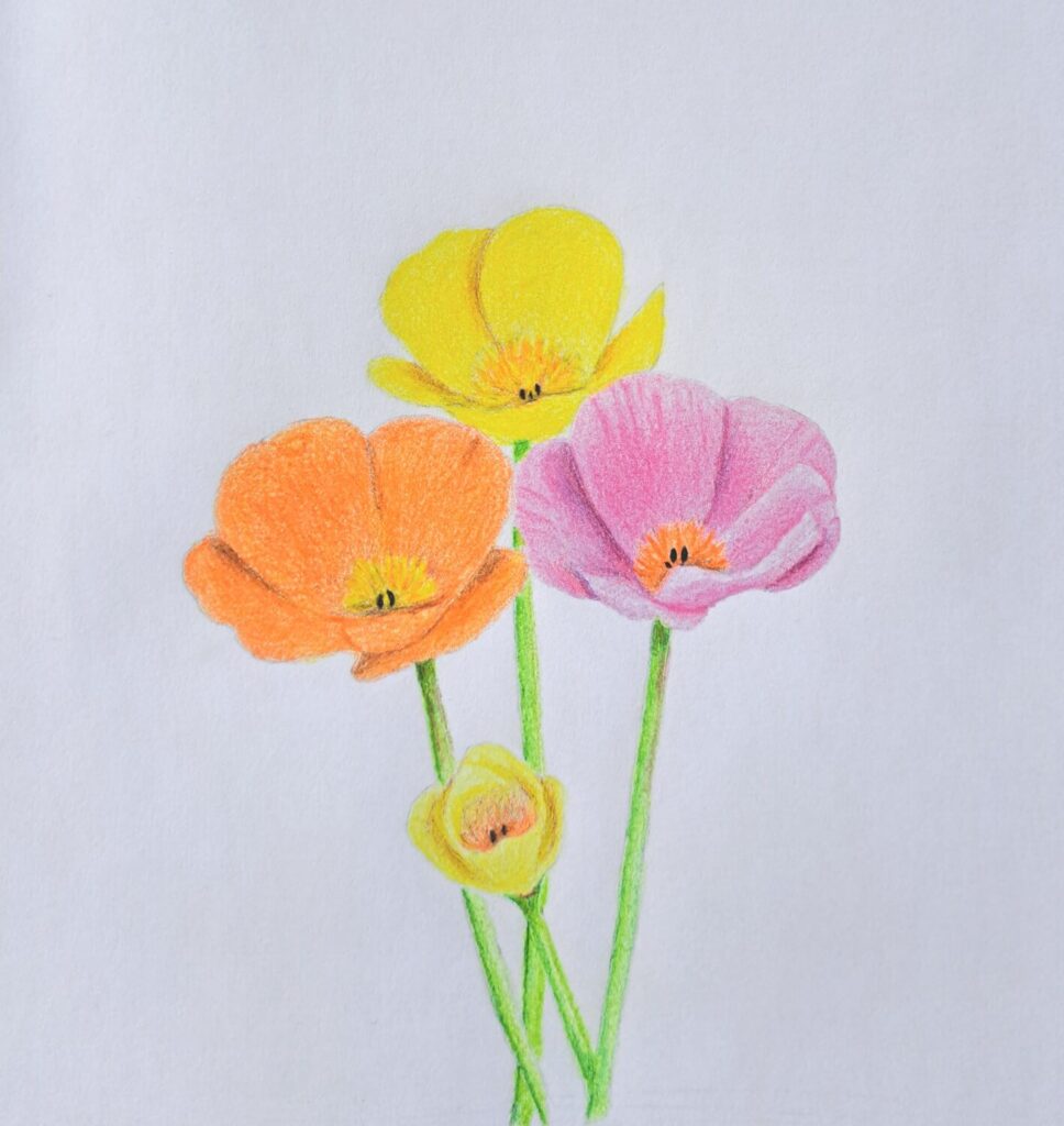
With the shadows established, I returned to each flower using the original colors. Another layer of orange, yellow, and pink was applied over the petals to strengthen the color while blending the complementary shadows underneath.
Rather than pressing harder, I continued building the colors gradually. Colored pencils reward patience, and several light layers usually produce smoother, richer results than a single heavy application.
I also deepened the green on the stems by adding slightly darker values along one side to suggest their rounded form. Finally, I made small adjustments across the entire drawing, strengthening a few shadows, smoothing transitions, and refining any petals that needed a little more contrast.
By the end of this stage, the flowers have vibrant color, convincing depth, and a soft, luminous appearance that captures the delicate nature of real poppies.
If you’ve enjoyed this tutorial, I recommend you check out the ones below as well:
- Drawing a Rose with Colored Pencils
- How to Draw a Daffodil
- Drawing Cosmos Flowers with Colored Pencils
Conclusion
If you’ve been following my tutorials for a while, you’ll know that every time I encounter a drawing block, I resort to grabbing any flower that comes to mind and sketching it. This helps me to get back my creative juices flowing.
I recommend you try it next time you run out of drawing ideas.
I hope you’ve found today’s tutorial both insightful and inspiring. I’d appreciate it if you could pass it along to just one friend. It would mean the world to me. Alternatively, save it on Pinterest for when you’re ready to act on it.